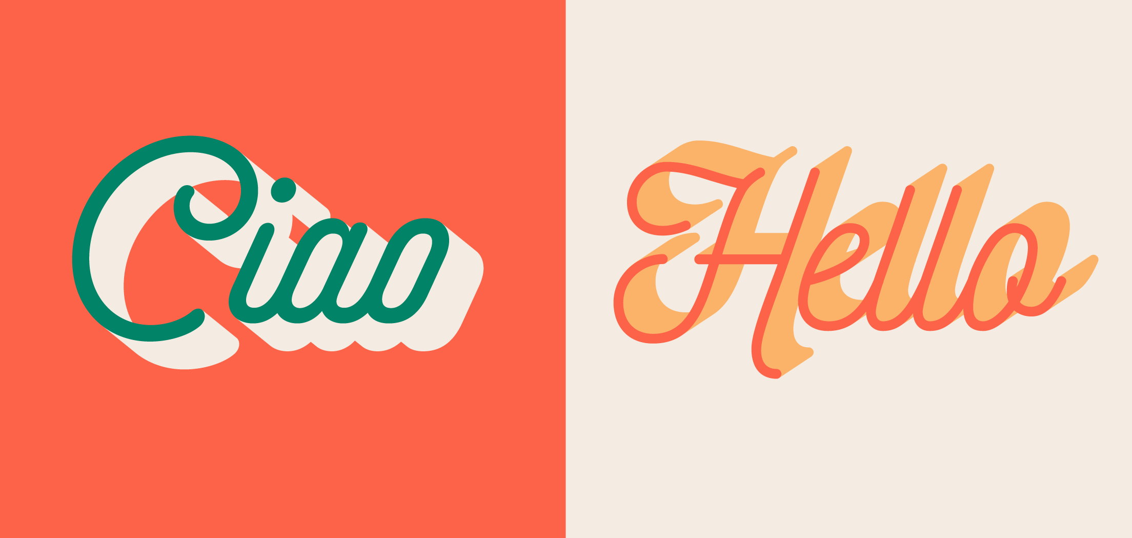
Innovative Graphic Design Techniques to Captivate Your Audience
In today’s fast-moving digital world, grabbing attention is harder than ever—and holding onto it is even tougher. As designers, it’s not just about making things look good—it’s about making work that connects. To stand out in a crowded market, your visuals need to do more than fill space. They need to tell stories, evoke emotion, and create memorable experiences.
Here are seven design techniques that help you do just that—techniques that add depth, energy, and personality to your work, while helping your message land with impact.
Use Bold Colours and Gradients
There’s a reason colour is one of the first things people notice in a design—it’s emotional, immediate, and powerful. Bold colours can help you stop the scroll and create visual impact, while gradients add richness and depth.
Use bold hues to inject energy into your designs, and choose gradient transitions that reflect the tone of your brand or project. Think beyond flat colours—dynamic combinations can modernise your visuals and draw the viewer in.
For exploring colour palettes and combinations, I love Coolers. It’s become an invaluable tool in my workflow.
Embrace Minimalism
While bold colour grabs attention, minimalism holds it. When done well, minimalist design simplifies and clarifies your message, allowing it to cut through the noise.
The key is intentionality. Use white space generously, stick to clean typefaces, and pare your visuals back to the essentials. Let your core message shine without competing for attention. A minimal design, when paired with strategic storytelling, is both elegant and effective.
Incorporate 3D Elements
3D design isn’t just a trend—it’s a way to create richer, more immersive visual experiences. Whether you're visualising a product, explaining a concept, or building a brand world, 3D elements help bridge the gap between imagination and reality.
They’re especially powerful in industries like tech, fashion, and architecture, but can be applied across the board. Use them to create depth, interest, and realism that traditional 2D visuals might not capture.
Use Animated Graphics
Animation is one of the most engaging forms of visual communication—it adds movement, energy, and emotion to your content. Whether it’s a subtle hover effect or a full-blown motion graphic, animation allows you to tell a story that static design can’t always convey.
Try using animated infographics, illustrated explainers, or short motion loops to make complex ideas feel approachable. Movement helps your content stay top of mind—and invites the viewer to stay a little longer.
Leverage Asymmetry
Symmetrical layouts are pleasing, but they can also be predictable. Asymmetry, when used intentionally, can guide the eye, create tension, and add interest. It’s a great way to create a sense of movement in your layout and bring fresh energy to your work.
The key is balance. Play with contrast, spacing, and focal points so that your layout still feels cohesive—even if it’s not centred or traditional.
Utilise Custom Illustrations
Illustration is a powerful way to inject personality into your brand or project. Unlike stock visuals, custom illustrations are tailored, intentional, and expressive. They add warmth, tell stories, and help brands feel more human.
Use illustrations to explain a concept, add a playful tone, or reinforce your brand identity in a way that feels unique. From detailed editorial-style drawings to simple icons and linework, there’s a style to suit every project.
Treat Typography as a Design Element
Typography isn’t just about legibility—it’s a design tool in its own right. Whether you’re crafting a headline, setting tone, or creating visual rhythm, the way you use type matters.
Play with scale, layering, and layout. Try mixing serif and sans-serif fonts or letting type become part of the illustration itself. Strong typography helps reinforce your message and adds visual interest without needing extra design elements.
Wrapping Up
Design that captivates is design that communicates—and that means more than just visuals. It’s about strategy, storytelling, and attention to detail. These techniques are just a starting point, but when used intentionally, they can take your work from visually interesting to truly impactful.
Want support creating more compelling, effective designs for your brand? Get in touch—I'd love to help bring your next creative project to life.


