Ideas that elevate brands.
Strategic impactful design.
Sorbido Visual Identity and Packaging
Sorbido is a new tequila brand blending tradition with a modern twist. The creative direction was a blend of modern and authentic, achieved with a minimalist logo and packaging, bold colours, and traditional Mexican symbolism.
El Paraíso Visual Identity and Packaging
Introducing the visual identity for El Paraíso, a new Spanish tapas and wine bar. Drawing inspiration from its name, which translates to "The Paradise," the design philosophy for El Paraíso is centered on creating a relaxing haven where guests can unwind and savour the moment. The brand identity captures the warmth and hospitality of Spanish culture, making El Paraíso a place you’ll want to linger in, enjoying the ambiance and flavours. The creative direction reflects this vision, with the sun icon symbolising warmth, life, and serenity, while the olive leaves evoke a lush, abundant garden. Together, these elements create a brand identity that transforms El Paraíso into a peaceful retreat where exceptional food, wine, and atmosphere come together to offer a truly blissful experience.
Revivo Visual Identity and Packaging
Revivo is a new energy drinks brand that embodies natural energy and wellness. The creative direction was modern, healthy, and fun. We brought the brand to life by leaning into the Italian roots of the name, creating a hand lettered logo that evokes a sense of traditional charm and artisanal products. To give the brand a sense of modernism, we paired traditional typography with a bold modern font, contrasting soft pastels and bold colours, and bespoke graphic illustrations.
The packaging was recently recognised in DesignRush’s Best Food and Beverage Packaging Design Awards—a rewarding acknowledgement that reflects the value of strategic, thoughtful design within the industry.
Fine Line Visual Identity
Fine Line is a stationery brand dedicated to crafting bespoke stationery that elevates everyday tasks into beautiful experiences.
The visual identity for Fine Line needed to be both robust and adaptable, capable of seamlessly integrating into their diverse collections while maintaining a cohesive vision. Our goal was to create a visual identity that reflects Fine Line's commitment to making everyday tasks beautiful and championing the importance of art in daily life. This branding project captures the essence of Fine Line's mission, providing a unified yet flexible aesthetic that resonates across all their product offerings.
Goodies Visual Identity and Packaging
Introducing the new visual identity and packaging for Goodies, a perfume brand crafting fragrances that smell so good, you'll want to eat them. The creative direction behind this project was centered on fun, playful, and bold elements, reflecting the brand’s unique concept. The design blurs the line between food and fragrance packaging, creating a visual experience that captures the essence of delicious, evocative scents. By merging these two worlds, the packaging not only entices the senses but also playfully challenges perceptions, making each fragrance a true sensory delight.
Golden Oaks Rebrand
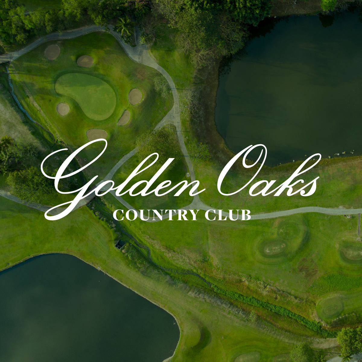
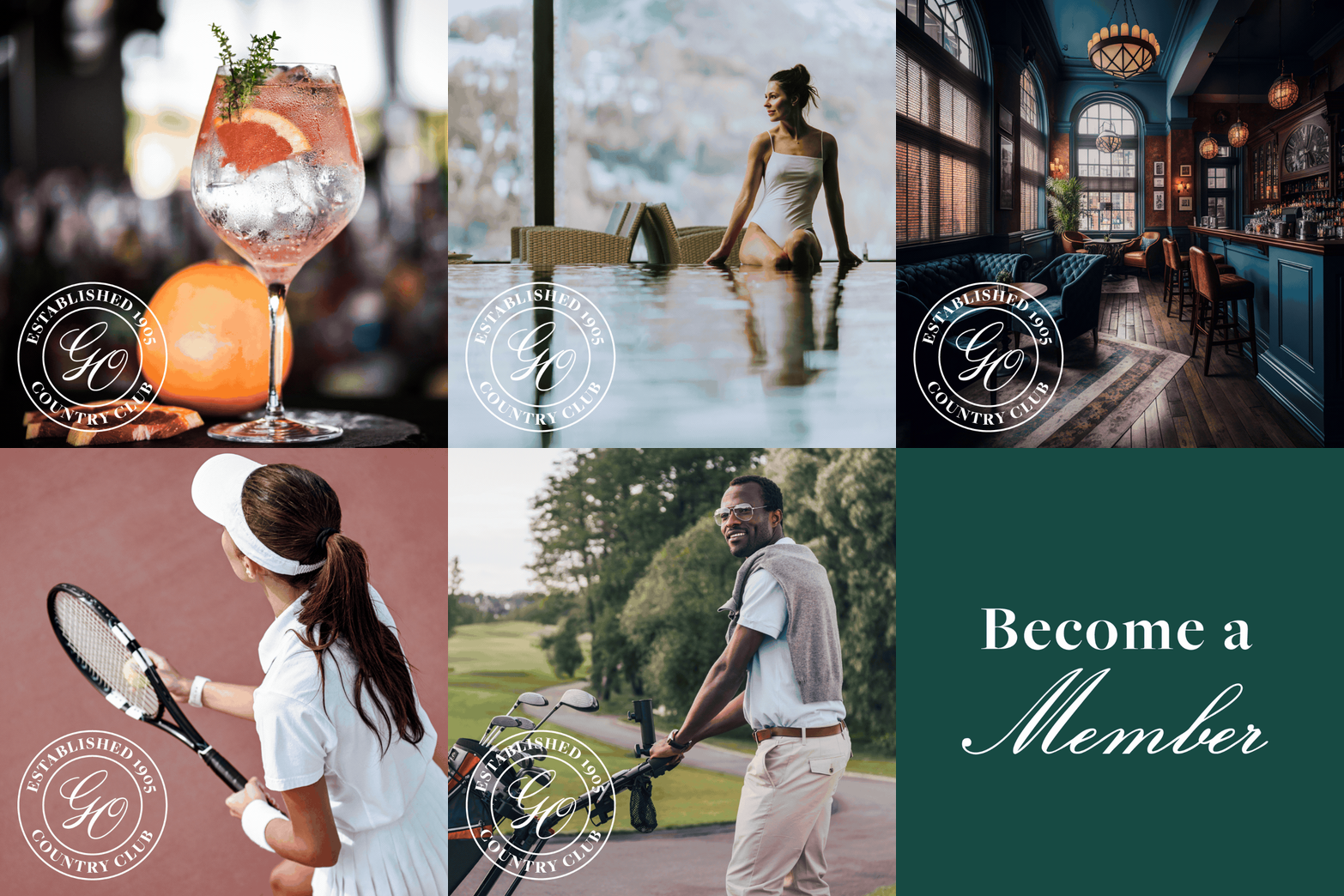
The Golden Oaks Country Club is a premium members only resort. Established in 1905, the club is rich is history, but it’s brand visuals were lacking in modern appeal. The creative direction sought to retain the club’s history and charm while establishing a brand presence that would appeal to a modern market.
The visual identity is refined and elegant, achieved with a hand lettered script logo, traditional typography and rich colour palette.
Sydney Web Fest Rebrand Case Study
This case study showcases the rebranding of Sydney Web Fest, where I introduced a fresh logo, vibrant visual identity, and a revamped website. Our mission was to encapsulate the spirit of digital storytelling through a comprehensive visual overhaul, including a new colour palette, brand fonts, bespoke imagery, visual language, content pillars, and cohesive social media templates, all aimed at strengthening the festival's brand presence.
The redesign extended to the festival's digital doorstep—the website—where I enhanced functionality and aesthetics to improve user experience. The outcomes were remarkable: a 20% decrease in bounce rate, a 200% surge in social media engagement, and a festival that completely sold out. This transformation not only reinvigorated the brand but also significantly deepened its connection with the digital storytelling community, demonstrating the power of thoughtful design and strategic branding.
Stage 1:
Creating a resilient brand identity, starting with a dynamic logo, wordmark, font styles, brand palette, repeating patterns, and graphic devices.
Stage 2:
Crafting a visual language that stays true to the essence of the brand, while also allowing for more effective communication and engagement with it’s target audience. This encompassed defining the brand’s content pillars, creating bespoke graphics and illustrations, and strategic content creation.
Stage 3:
Complete redesign of the website with user experience optimisation as the driving factor. The website required a redesign to reflect the new brand identity for cohesive branding, but it was also in need of a dramatic reorganisation of content to help reduce the bounce rate, and keep visitors engaged. My strategy involved keeping the majority of web content on the home page, separated into sections, rather than pages; consolidating copy and using imagery to tell the story where appropriate; and ensuring the design was optimised for all devices. The result was a 20% decrease in bounce rate within the first month of relaunch, and a significant increase in submissions and ticket sales.
Stage 4:
Ensuring that the new brand identity and visual language are in place across all touchpoints. This involved the creation of social media templates, profile graphics, and event collateral, to ensure a consistent brand image.


