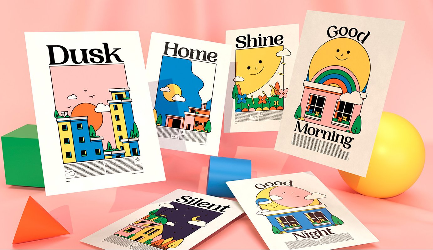
How to Integrate Candy-Coloured Pastels into Your Illustrations for a Playful Touch
There’s something irresistibly charming about pastels. Maybe it’s their softness, maybe it’s the way they quietly command attention without shouting—or maybe it’s the nostalgia they bring. Whatever the reason, candy-coloured pastels are having a serious moment in 2024, and if you’re looking to add a touch of whimsy or lightness to your work, these shades are well worth exploring.
Why Pastels Are Worth Your Attention
Pastels have long been associated with springtime, childhood, or vintage design, but today they’re showing up in bold new ways across branding, packaging, illustration, and more. Their versatility is part of their magic—used well, they can feel minimal, modern, joyful, or dreamy.
They’re also incredibly adaptable. Want to soften a bold concept? Add a pastel accent. Looking to convey a sense of calm or playfulness? A pastel colour palette can set the tone instantly.
How to Use Pastels in Your Illustration Work
1. Start with a Limited Palette
Too many pastels can wash out your composition. Instead, build a colour story by starting with two or three complementary hues, then layering in neutrals or bolder contrasts to keep things grounded.
2. Layer Colour for Depth
Whether you’re working digitally or traditionally, layering pastel shades can add a surprising amount of depth. Soft gradients, tonal shifts, and overlapping textures can give your artwork more dimension while still maintaining that airy pastel feel.
3. Pair Pastels with Bold Contrasts
To make pastel elements pop, pair them with rich earth tones, charcoal, or even black. This contrast adds visual tension and can guide the viewer’s eye through your work.
4. Use Texture to Avoid Flatness
Pastels can feel flat if not handled carefully, but texture brings them to life. Whether you’re using grainy brushes, subtle paper textures, or layering pencil strokes, this added dimension keeps your work feeling tactile and intentional.
5. Create Atmosphere with Light
One of the most effective uses of pastels is to evoke mood. Soft skies, dreamy lighting, hazy memories—they’re all pastel territory. Use lighting strategically to suggest time of day, tone, or emotion.
Tools to Help You Get Started
Whether you're working digitally or traditionally, the right tools make all the difference. Here are a few of my favourites:
Procreate (for iPad) – My go-to for digital illustration with a hand made feel. Combine it with textured brushes like this brush set to recreate a traditional feel.
Adobe Fresco – Great for blending watercolour and pastel effects on desktop or tablet.
Prismacolor Premier Soft Core Pencils – If you love working traditionally, these are smooth, pigmented, and blend beautifully.
Winsor & Newton Pro Markers – For bold designs with clean lines.
You don’t need to invest in everything at once—start with what you have, and experiment. Pastels are forgiving and fun, which makes them perfect for play.
Wrapping Up
Adding candy-coloured pastels to your illustration work is more than a trend—it’s a way to infuse your art with softness, personality, and a sense of wonder. Whether you’re creating dreamy character scenes, playful packaging, or mood-based editorial work, pastels offer a versatile palette to explore.
Let them bring a touch of joy to your next project—and don’t forget to tag me if you share it online. I’d love to see what you create.


