Font Psychology: Unlocking the Secrets of Typography

Ever wondered why some fonts make you feel a certain way? The right font can make all the difference in your design.
Whether you're crafting a logo, designing a website, or creating social media graphics, understanding font psychology is key. I've put together a quick guide to help you choose the perfect font for your next project.

Serif fonts evoke a traditional, classic, and elegant aesthetic. They convey a sense of trustworthiness, authority, and formality, making them ideal for established brands and professional communication.
Popular examples: Times New Roman, Georgia, Garamond, Baskerville

Sans-serif fonts offer a modern, clean, and simple aesthetic. They feel approachable, friendly, and straightforward, which makes them perfect for brands looking to appear accessible and contemporary.
Popular examples: Arial, Helvetica, Poppins, Futura, Roboto
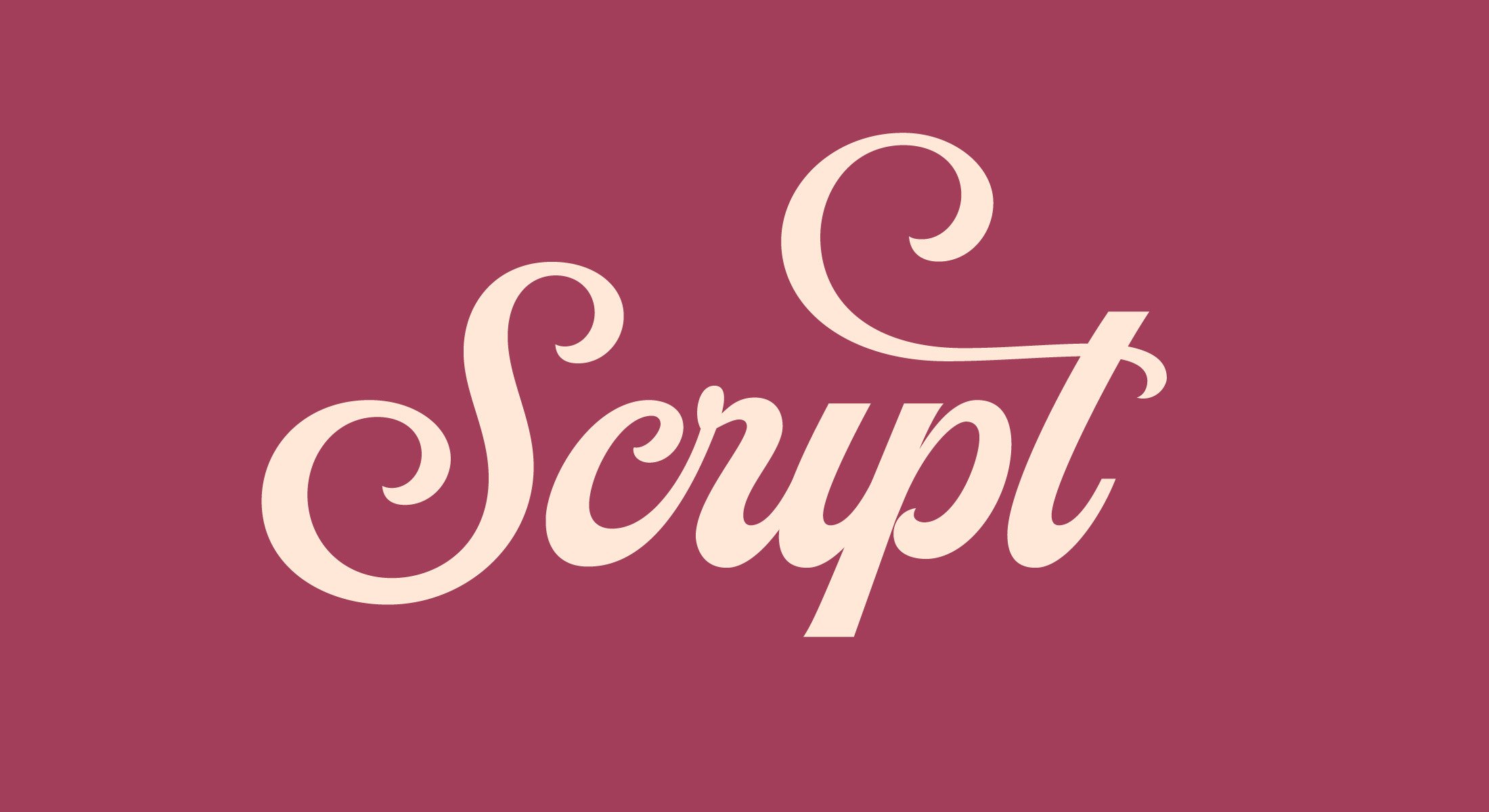
Script fonts have a decorative, cursive, and flowing aesthetic. They can create a sense of nostalgia, and bring an elegant, personal, and creative feel. Highly versatile, they’re perfect for invitations, logos, and any design project that benefits from a touch of sophistication.
Popular examples: Brush Script, Pacifico, Monarda, Raksana, Thistails
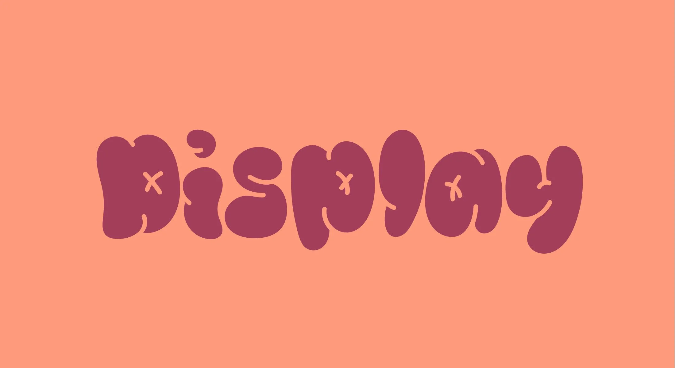
Display fonts are bold, attention-grabbing, and unique. They impart a fun, dramatic, and expressive feel, making them a great choice for signage, logos, posters, and any content that needs to stand out.
Popular examples: Impact, Gently, Swell, Buster, Centrio

Slab serif fonts are solid, impactful, and bold. They provide a strong and reliable feel, making them the perfect choice for headlines, posters, and any design that needs a robust and sturdy presence.
Popular examples: Rockwell, Courier, Clarendon, Shift, Amasis

Handwritten fonts offer a personal and expressive aesthetic. They can feel casual, friendly, and intimate, making them great for personal notes, creative projects, and any design where you want to add a human touch.
Popular examples: Photoshoot, Northwell, Printed Moments, Sanshand, Quavo

Blackletter fonts exhibit a gothic, ornate, and historical aesthetic. They provide a dramatic, traditional, and serious feel, often used in formal documents, certificates, and designs seeking a vintage look.
Popular examples: Old English, Ghosthey, Lordish, Rumblekill, Greyhood
Wrapping Up
Understanding font psychology is essential when pairing the right font to a project. While a font may be attractive, it’s not always going to be appropriate in context. So the next time you’re working on a project and looking for the perfect font, be sure to keep in mind the message you’re trying to convey, how you want the reader to feel, and the connection you want them to make.